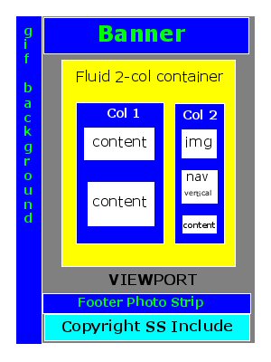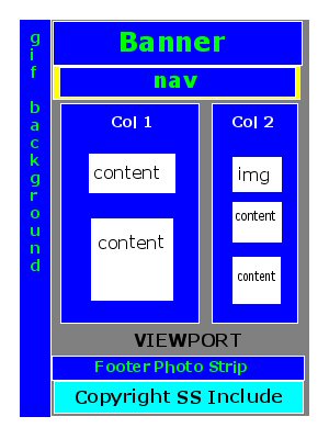


Grey represents the Viewport. (To my friends: I believe that means your main browser window - the area on your screen in which you see a web page.)
In the sketches, the grey viewport is covered at the top, left and bottom by blue and cyan areas, each of which have thin white borders. Those areas represent material that show on every page on my site, and I'd like those areas (blue or cyan with white borders) to remain in the same relative position on every page, if and when a visitor re-sizes the Viewport (uhhh, window).
So, the top, left and bottom blue areas with the thin white borders, and also the single cyan area at the bottom, represent parts of the pages I would like to have remain always in the same relative position (for every page).
My previous sketch (on the left) shows a big yellow area which is enclosed, except on the right, by the banner, the .gif background image, and the footer strips. That yellow area represents a container for the "inner" part of the page. I'thought I would need a container within which to put the columns (divs - the inner blue areas). which in turn, hold the white divs which would hold the content of the page.
Eeek! This begins to sound like The House That Jack Built.
My goals are to achieve maximum accessibility, including for people with disabilities, and those with text-only browsers. I'd still like to present attractive pages for those who see well.
Also, I'd like pages to load fast, partly to serve people like me, who live in the boonies, and have only dial-up access to the Internet.
Luckily, I don't mind making changes when change results in useful effect. or in something I really like the looks of.
And again, let me encourage any of my dear (or even un-dear) friends who might be interested to try your own hands at building yourselves web sites.
My previous and new sketches are near the top of this page, and I provide an explanation, along with my now a bit less-confused thoughts.
To my uncomputer friends: "nav" stands for "navigation," meaning the area on a web page that contains the main links that let you navigate, or find your way,around a web site.
As far as I can determine, putting NAV on the right seems poor, not good, for accessibility.
I tried vertical navigation on the left, and might still consider trying that, but to do so would confuse my column-and-content ideas. For instance, I would probably want three columns if I put vertical navigation on the left. But anyone reading on my site will notice the screaming-huge text! You can, of course, change the size in your browser, but that may not be sufficient to make the whole thing coherent, at least, not in my terms. (Sorry, I'm not sure what I mean here - as usual!)
I don't really know what "fluid" or "liquid" layout means, but am guessing that it means content remains at least comfortably arranged and visible, with a clean-looking layout, as a visitor changes screen resolution, and/or the size and shape of the viewport. Within reason, of course. Someone who shrinks a window so it takes up an inch or two at the bottom right of the screen probably can't see my page as I intended, and I won't worry about that [deadpan].
Where gutters show in the sketch, I mostly intend them as gutters, both to ease visibility for signted people and to aid (I believe!) in fluidity, or liquidity (the same again, old chap?)
I just don't know what in particular is workable for the content on this site, both as it is now, and as I continue deveopment. My predilection for large text comes from my own astigmatic vision, along with the typical deterioration I get from being old.
Maybe I should add that I visit many wonderful sites, especially since beginning to try to make my own. I love the presentation on SimpleBits and A List Apart. Text on both sites appears smaller to me, if I change nothing, than on my own site, but I find it very easy to read.
As I explore, I also discover things I don't understand yet, such as a container that uses a div (division; that's right, right?) with an ID of "wrap," which appears to serve something like the yellow fluid container I had trouble with, and so discarded. But when I tried it, I did so as the left-side sketch shows, excluding the banner. Maybe that container should have contained the entire page, including the banner and footer area. because I see at SimpleBits, on the Work page, that "wrap" ID apparently containing both banner and footer areas. Also, I see something new to me in concept - the first body tag in the XHTML code contains an ID specification also.
I'm not sure just what it is I'm learning here!
I have settled on Vertical Navigation for the moment.
I don't like ladders, but can climb them if I have to.
This page now repesents my current chosen layout. I have lots of people to thank for their help, and I thank some of them on this page.
As I mentioned before, somebody pointed out to me that if I was going to bother to change from HTML 4.01 Transitional to HTML 4.01 Strict, I might as well, and perhaps might better, change to XHTML 1.0 Strict instead. So I did! It's very easy to make that change!
I got Russ Weakley's Liquid Layout to work with Internet Explorer this morning!
Finally I managed to change this page from HTML 4.01 Transitional to HTML 4.01 Strict. I will need to edit each page on the site to accomplish a similar change.
Changing the HTML code is quite easy to do,and the W3C MarkUp Validation Service makes it easy, by showing tips on how to do it. Not only that; it will find typographical errors in code. Unfortunately, it won't find errors in my text, or what is generally called "content"(deadpan).
After a lot of experimenting and testing, just learning how to manage a horizonal navigation area, I've decided to stick with it for my first layouts with two columns. I also played with vertical navigation on the left, using a three-column layout, but didn't care for that, probably just because I don't fully understand the implications of such layouts yet. I'm keeping my experimental pages, so if I decide to make some pages with three columns and vertical navigation on the left, I could do that.
However, it seems to me wise to have the navigation area located similarly on every page on the site, and all the experienced web-developers indicate that consistency in structure is important. That makes sense, of course! So, for now, I'll stick with a horizontal navigation area on all pages here.
In the previous sketch, on the left, I show a container for content at the bottom of Column Two, following the NAV area.
I don't know if that's really workable. Might it be workable if it's merely an image? I'm thinking of screen readers for the visually-impoaired.
But perhaps it's best to put nothing, other than footer content, after the navigation area?
Recently, I read somewhere that there exists the possibility one's external CSS file somehow misses getting connected to the page the visitor is looking at, and as far as I can tell, that might occur more often than somebody like me might think!
So possible loss of CSS-presentation is also a consideration, and I would like my pages to survive in readable form if my CSS somehow disconnects frm the page.
I think I do understand that I need to end the page with the [body] and [html] tags. [chortle!] So, if I were to put the navigation vertically on the right, as the left-side sketch shows, maybe I should discard the content area shown below the NAV area, so that only the the decorative footer strip and the copyright notice remain to be displayed. (?)(?)
Perhaps such thoughts become irrelvant if I put the NAV area just below the banner, as I show in the right-side sketch.
As I work to make my two-column layout,I have managed to come up with a headings area into which I want to float the dog-logo to the right.
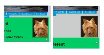
I'm missing some knowledge about how to handle Internet Explorer, or maybe, any of the typical browsers, but Firefox, Opera and Netscape all show the dog-logo floated right in the headings area (colored green here), but Internet Explorer sticks it on a line of its own, above the headings area if I put the code for it above, and below the headings area if I put the code below.
I have no idea how to get Internet Explorer to put the logo into the green headings area.
I posted this question to the WebDeveloper Forums, with a small copy of the following image.
But if anybody reading this knows how to fix it, you may also send me (plain-text only) email, by clicking on my name in the copyright footer on this page.

Besides my problem with floating the dog-logo to the right and getting it to lie over the headings area, I have another problem with Internet Explorer. This time, unlike the last, the page looks all right in Opera, Firefox and Netscape (all in current versions).
Maybe my current, Internet-Explorer-only problem has something to do with the way that browser handles margins, or maybe it's the "box model" problem, or maybe a bit of both. I don't know how to search out what the problem is.
It also looks to me as though it might be related to the problem with floating the dog-logo to the right in the headings area.
I mentioned this kind of difficulty before, indicating it as a "bottomless pit" problem, where my two columns didn't appear in two columns at all; instead, Column Two dropped down below Column One. Column Two was present, but it was falling down the well (ding-dong-bell).
I hadn't used any positioning statements, but gathered none should be necessary, either, and I'm avioding absolute, or fixed, or relative positioning, if I possibly can, largely because I'm trying for a fluid or liquid layout, a la MaxDesign
I find Russ Weakley's tutorials really helpful, and I used them for the Two-Column Home Page which still has plenty of little problems, but it works. That is, I got it to works with Opera, Firefox and Netscape, but not with Internet Explorer.
My previous, No Columns, or "bottomless pit" page, has one big difference from my current version; that is that at least Opera, Firefox and Netscape show my new version with the columns somewhere near where I intended them to be.
I colored the columns in order to see what I'm doing more easily, and plan to change those colors before I use this layout for my real home page. Hope the colors don't make anybody feel sick. And for now, I'm ignoring many other small glitches that need fixing to tailor the layout to my satisfaction. My concern right now is how to get Internet Explorer to display the page anywhere near the way I'd like it to.
Fang, of the WebDeveloper Forums, solved my difficulty with Internet Explorer refusing to show the picture of Kwali within the green headings area.
He said to nest the code for the logo inside the headings code.
Oh, my! Isn't that logical? I think so! It only took a moment to make that change, and, Violin, Viola, Cello (or, if you prefer, Voila), there appears Kwali's picture, in the green headings area, instead of sitting above it, when I looked at the page with Internet Explorer.
How logical, how simple, and how easy to change! Now you can see why I am so grateful for help from those forums.
BonRouge is another contributor to the WebDeveloper Forums. You can find him at BonRouge.com, where he provides all kinds of useful information about styling, or, using CSS (Cascading Style Sheets) to format a web page.
BonRouge responded to my questions about widths in columns with a very rich analysis that gave me a number of possible approaches to making the kind of fluid layout I want.
Someone on the WebDeveloper Forums mentioned to me a site in Australia that has wonderful assistance with layout.
I've just been looking at an article by Russ Weakley, entitled Liquid layouts the easy way
Although the article illustrates a three-column layout, it looks easy to adapt to a two-column layout, and if I use my head, I can use the same style sheet for either two- or three-column pages.
Still, please don't expect significant layout changes to this site for a time, because I need to learn, practice, validate my files, and also, to continue working on changing from HTML 4.01 Transitional to HTML 4.01 Strict,
Until I manage to accomplish changes from Transitional to Strict, I am using a bit of CSS (Cascading Style Sheet) code posted by MstrBob in replies to my questions, on just a few pages here, including this one. That code provides the horizonal navigation area that has a blue-green colored background and white text.
Its somewhat strange behavior is the result of my applying the code without knowing what I'm doing.
The links work, though, so I'm leaving the code in place until I learn more about how I want to style the navigation area (links to other pages on this site).
Some people on the WebDeveloper Forums have been helping me with posts directed specifically at my questions, including particularly Triumph, Fang, Ray326, and Toicontien. MstrBob has been especially prolific with his help. But sometimes others have replied to my posts with helpful remarks and examples, and also, many on the Forums have written other posts I've found wonderfully helpful. Long live the WebDeveloper Forums and their contributors!
You can help answer my questions on the WebDeveloper forums
If you prefer, you can click on my name in the copyright notice to send me email
P.S. If you send me email, you will need to do so in plain text only, to make sure I receive it. However, if you email me and ask me to whitelist your address, then after I do that, you can email in HTML, send attachments, and so forth. I'll then let you know when I've whitelisted your email address.
You won this by attending on this page, whether you are a WebDesigner or a Curious, Nosey, or Brave Visitor, or all of these things, or none of them.

But I wouldn't blame you for not reading all this stuff[ing].
Loborobem obipsobum dobolobor sobit obamobet, cobonsobectobetobur obadobipobisobicobing obelobit, sobed dobo obeiobusmobod tobempobor obincobidobidobunt obut lobaboborobe obet doboloborobe mobagnoba obalobiqobua.
Could anybobodoby sobing thobat?

Your Official SuperHelper number remains valid till your next visit, when you get a new number.
(Weird, yes?)
Last modified on
Friday, 04-Sep-2009 20:54:23 PDT
It is now
Sunday, 19-Sep-2010 02:17:07 PDT

